

Early-stage startup
EXPERTISE
Timeline
Type
Mobile App, iOS, MVP
We’ve all done it—saved a link, a file, or a map pin with every intention of coming back to it. And then? It disappears into a pile of digital clutter.
That everyday behavior became the foundation for SeeU Later: a mobile MVP designed to help people not just save things—but actually revisit or release them without guilt.
I joined an early-stage startup already exploring this space and helped shape the idea into a clear, testable product direction. We designed the experience to feel light, unobtrusive, and supportive—built around how people really act, not how they’re expected to.
As the only designer on the team, I led everything from early research and concept framing to UX architecture, prototypes, and the visual identity.
📌 Joined an early-stage startup to design a calm, mobile-first content-saving app
🧠 Conducted user research revealing guilt and overwhelm as core emotional blockers
🎨 Created the visual identity, brand tone, and a friendly alligator mascot
🔁 Defined and designed the MVP, focusing on minimal pressure and soft reminders
Click to fast
forward
Our goal wasn’t to build another productivity tool. It was to create a lightweight, mobile-first product that helped people feel more in control of the content they save—without turning their digital lives into more work.
🎯 Product objectives
Design an MVP that supports saving and revisiting a variety of content types (links, notes, media, files, map pins)
Focus on an experience that feels non-intrusive, emotionally supportive, and easy to use
Build flows around natural user behavior instead of idealized task management
Test and validate a simple system for reminders and cleanup that respects user autonomy
💼 Business goals
Explore early demand for a peace-of-mind product, not a traditional organizer
Explore a freemium model with local storage by default and cloud-based upgrades
Set the foundation for future monetization through premium features (shared folders, team use, smart reminders)
I was the solo designer on the project, owning everything from early research to interaction design. I wasn’t just supporting the team—I helped define what the product would be. My work shaped the experience from day one, through close collaboration with the PM and developer to align design, tech, and user needs.
🧭 Mapped out drop-off patterns and blockers through early research and interviews
✍️ Defined the core experience from first wireframes to polished flows and edge cases
🎨 Built the full visual identity—UI system, branding, and tone
🤝 Worked side-by-side with PM and dev to scope realistically and prioritize with impact

To understand how people actually save and revisit content, I ran a round of early user interviews with designers, developers, students, and digital collectors. Everyone had tools—but what they lacked was clarity and peace of mind.
They saved links, screenshots, files, or places with the intention of returning—but rarely did. Some forgot where they stored things. Others felt overwhelmed and avoided going back entirely.
“I save stuff all the time. But I never go back. It’s like... once I’ve saved it, I stop thinking about it.”
That quote summed it up: saving gave people a false sense of control. They weren’t organizing—they were offloading.
To complement these interviews, I also ran a focused competitive analysis of tools like Raindrop, Mymind, and Fabric. While some offered sleek design or powerful curation features, none addressed the emotional burden of saved content. Most assumed users were motivated, intentional organizers. Ours wouldn’t.
This helped us shape a clear value proposition: SeeU Later would focus not on productivity—but on peace of mind. To support this direction, I created a series of focused artifacts—competitive grids, heuristic evaluations, and flow maps—to help us prioritize clearly and avoid overbuilding. Each one clarified where we could do less, and do it better.
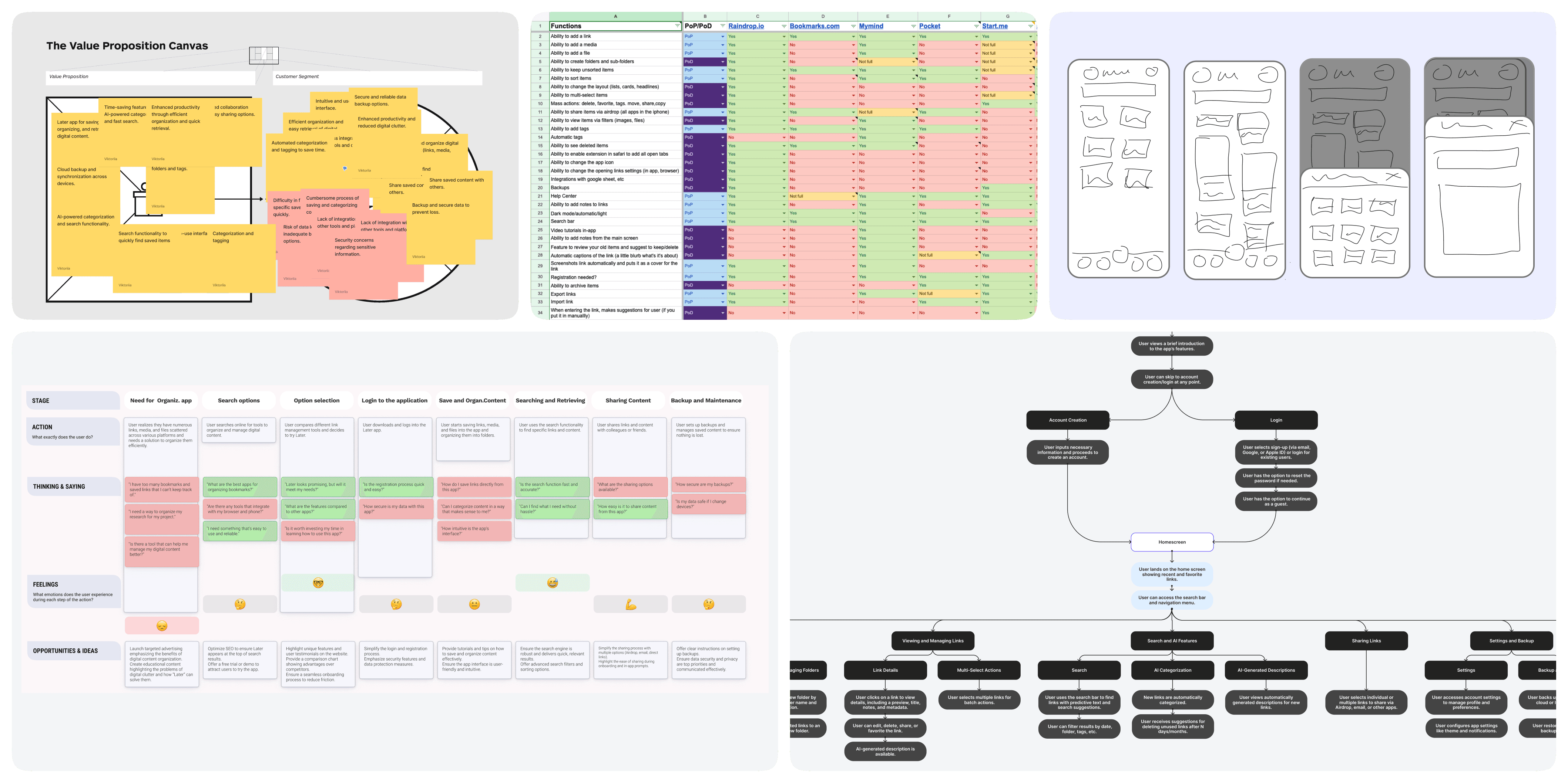
Before jumping into wireframes or feature lists, we took a step back to reflect on the people behind the product. We didn’t want to assume our users were just productivity-driven or hyper-organized. We wanted to understand the emotional reality of their habits—why they save things, what they hope for when they do, and how they feel afterward.

👉 Who it was actually for
The answer wasn’t productivity geeks. It was everyday people saving stuff to feel safe, not sorted.

🤔 Hypothesis statement
We believed that if we gave people a way to save quickly without organizing, and allowed them to revisit softly, they’d build a healthier relationship with digital content.
That’s why:
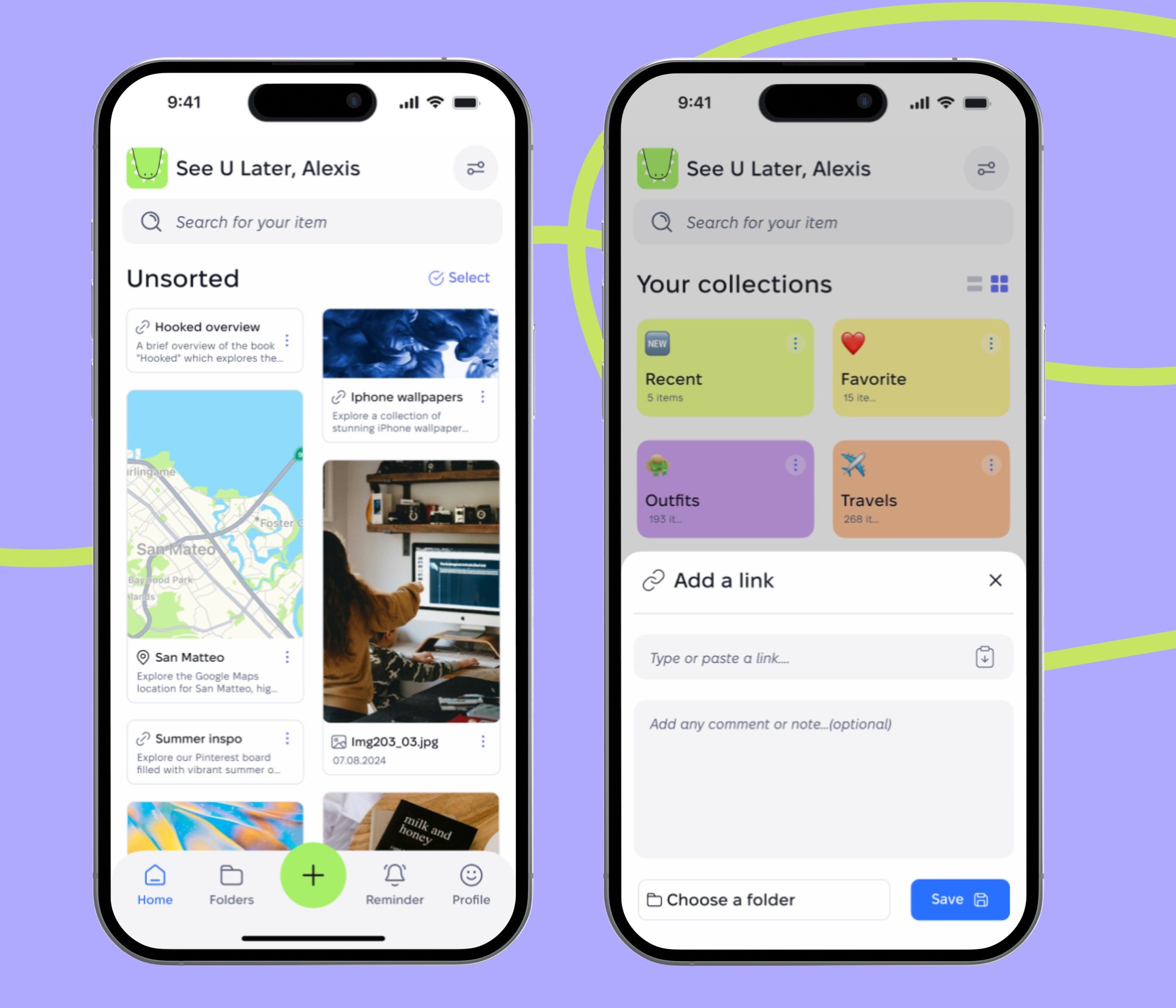
We prioritized Unsorted view over folder setup
We built Reminders into the UI—not as push notifications
We skipped onboarding tours and let users discover features gradually
We weren’t just testing usability. We were testing emotional response.


We weren’t building a high-performance productivity app. We were building something people could feel relieved using. The brand had to reflect that from the very first touchpoint.
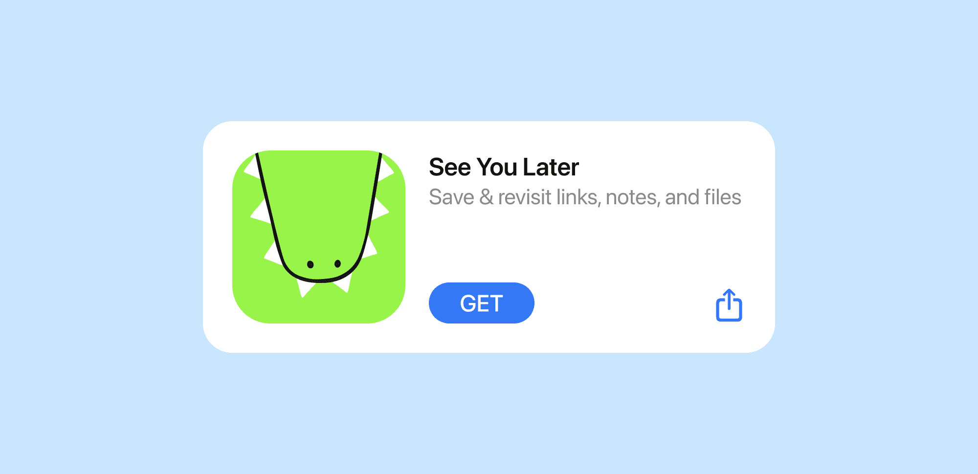
The name came naturally: SeeU Later—a phrase I often said out loud when closing my laptop or saving something “for later.” It was warm, familiar, and slightly ironic. Because let’s be honest: most of the time, we don’t come back.
It also helped us define the tone: calm, supportive, and a little bit playful.

We translated that tone into visual and interaction choices that shaped how the product felt, not just how it looked:
✅ The visual identity was kept low-pressure and approachable: soft greens, rounded corners, and clean typography replaced bold colors or harsh gradients.
✅ We avoided productivity jargon and used gentle, emotionally neutral language like “Still need this?” or “It’s okay to let go.”
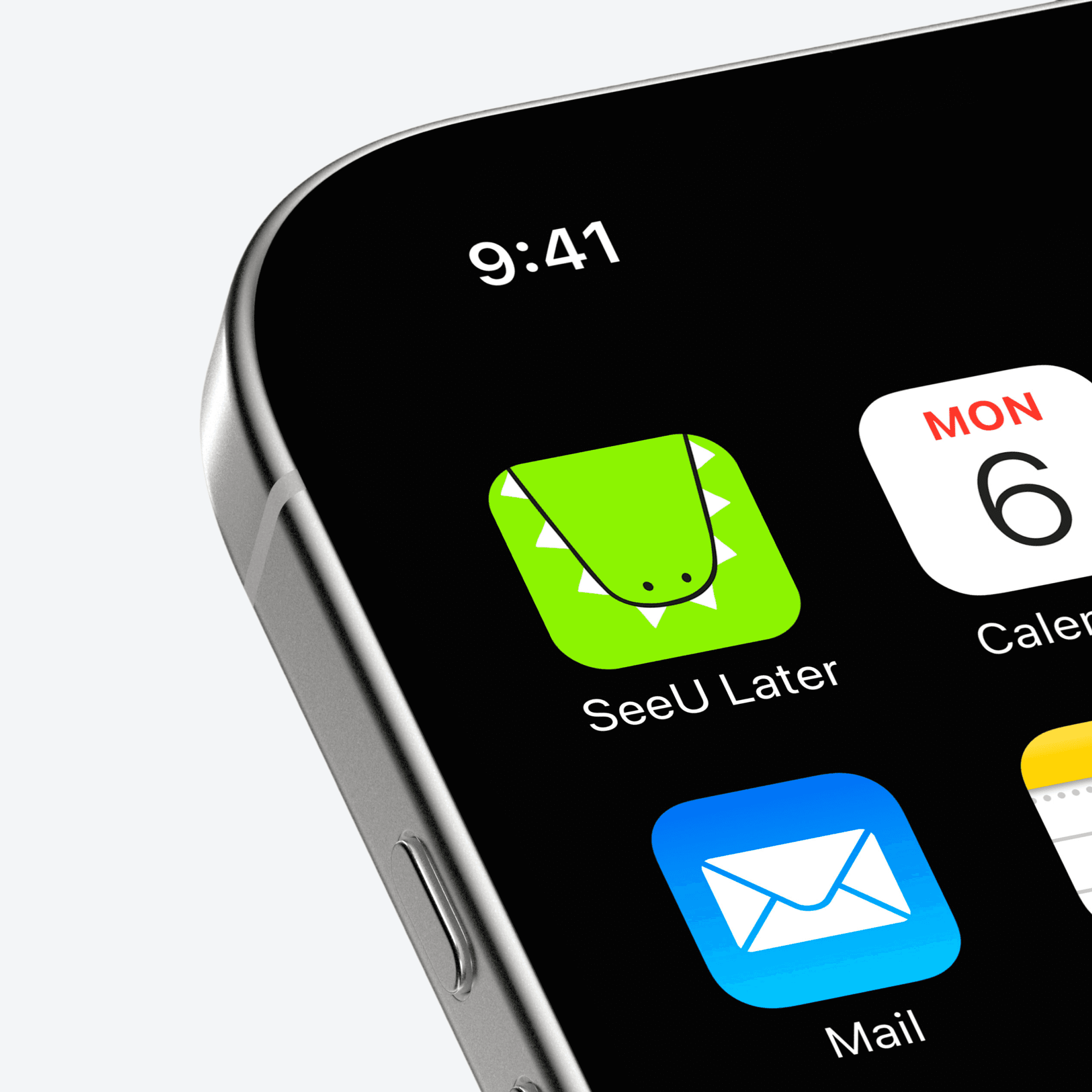
✅ A small, friendly green alligator mascot appeared in reminders and empty states—subtle but memorable, giving the app a human tone without becoming playful for the sake of it.
Once the loop (save → forget → revisit) was validated, I moved into designing an experience that felt like a break, not a task.
I built the Unsorted inbox because users said organizing upfront was a blocker. Cards showed just enough detail to jog memory without needing action.
I added long-press batch actions after testers complained about tedious cleanup. This made it easy to clear space without pressure.
I designed a Reminders tab because people ignored notifications—but said they'd check in if the app asked nicely. We didn’t want alerts; we wanted soft nudges.
Every layout, preview, and action was shaped to say: It’s okay. You’ve saved it. Come back when you’re ready.


Results and reflection
SeeU Later was paused with intention—not abandoned. Before moving forward, the team plans to review the product’s long-term direction, and re-evaluate which features should move forward. The foundation is strong, but there’s more to explore—especially around premium features like cloud sync and the long-term habit loop.
Lessons learned
This project reminded me that emotional UX is real UX. I wasn’t just designing flows—I was designing how users would feel while moving through them. The smallest decisions, like tone and pacing, had the biggest emotional impact. I also learned that an MVP isn’t about building less—it’s about building what matters most. Saying no to features like folders and complex onboarding made the product more honest and easier to use. And finally, I learned that working in a startup isn’t just about moving fast—it’s about creating clarity in chaos
I'm happy to share more about this project and how I work :)
